Tuesday, April 21, 2009

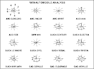
Star Plots


This is a Star Plot denoting cars and their variables. Star plots are a graphical data analysis method used for deciphering behavior of variables in a data set. They consist of equiangular spoke, or radii, that represents a variable. Lines are drawn connecting the data giving it the star appearance. 

Found At: http://www.itl.nist.gov/div898/handbook/eda/section3/starplot.htm

Correlation Matrix


This is a Correlation Matrix of protein correlation. The correlated behavior ranges from the reds to blue in a triangular process. These matrixes lists variable down one column and across the first row. It indicates the strength and direction of a linear relationship between two random variables.

Found At: http://yin.che.wisc.edu/images.htm

Similarity Matrix


This is a Similarity Matrix showing scores that decipher similarities between tow data points. They are typically used in a sequence alignment and the higher the score results in the more similar characters it denotes.

Found At: http://tomcat.esat.kuleuven.be/txtgate/tutorial.jsp

Stem and Leaf Plot


This is a Stem and Leaf Plot depicting the GNP of Western African nations. Graphs like this are used to show quantitative data in graphical form to help people visualize the distribution among the categories. 

Found At: http://mainland.cctt.org/mathsummer/JosephBond/StemAndPlots/stem-and-leaf_std.htm

Box Plot


This is a Box Plot used to portray numerical data groups through number summaries. They can be used to portray differences in population without making statistical distribution assumptions. 

Found At: http://support.sas.com/rnd/base/topics/statgraph/proctemplate/images/boxplot.gif

Parallel Coordinate Graph


This is a Parallel Coordinate Graph representing multivariate relations denoting specific properties of the relationship corresponding to the geometric representation of the graph. 

Found At: http://raffy.ch/blog/2007/03/

Triangular Plot


This is a Triangular Plot of conservative, liberal and labour votes. This is data from the UK in 2005 and the dot represents the percentage of votes based on polls. These graphs portray three sets of data. The three variable are easy to represent in a triangular fashion. 

Found At: http://www.ex-parrot.com/~chris/wwwitter/20050407-it_doesnt_matter_how_you_vote_either_way_your_planet_is_doomed.html